Aura+
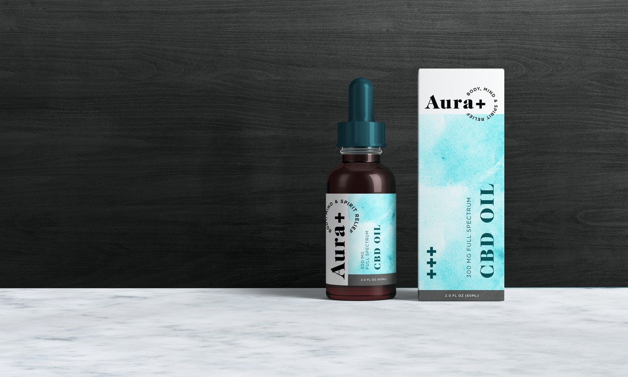
Aura+ carries high-quality CBD wellness products focused on science, health and CBD education. Their CBD is extracted and formulated by chemists with PhDs in Organic Chemistry who have extensive industry experience.
Objective
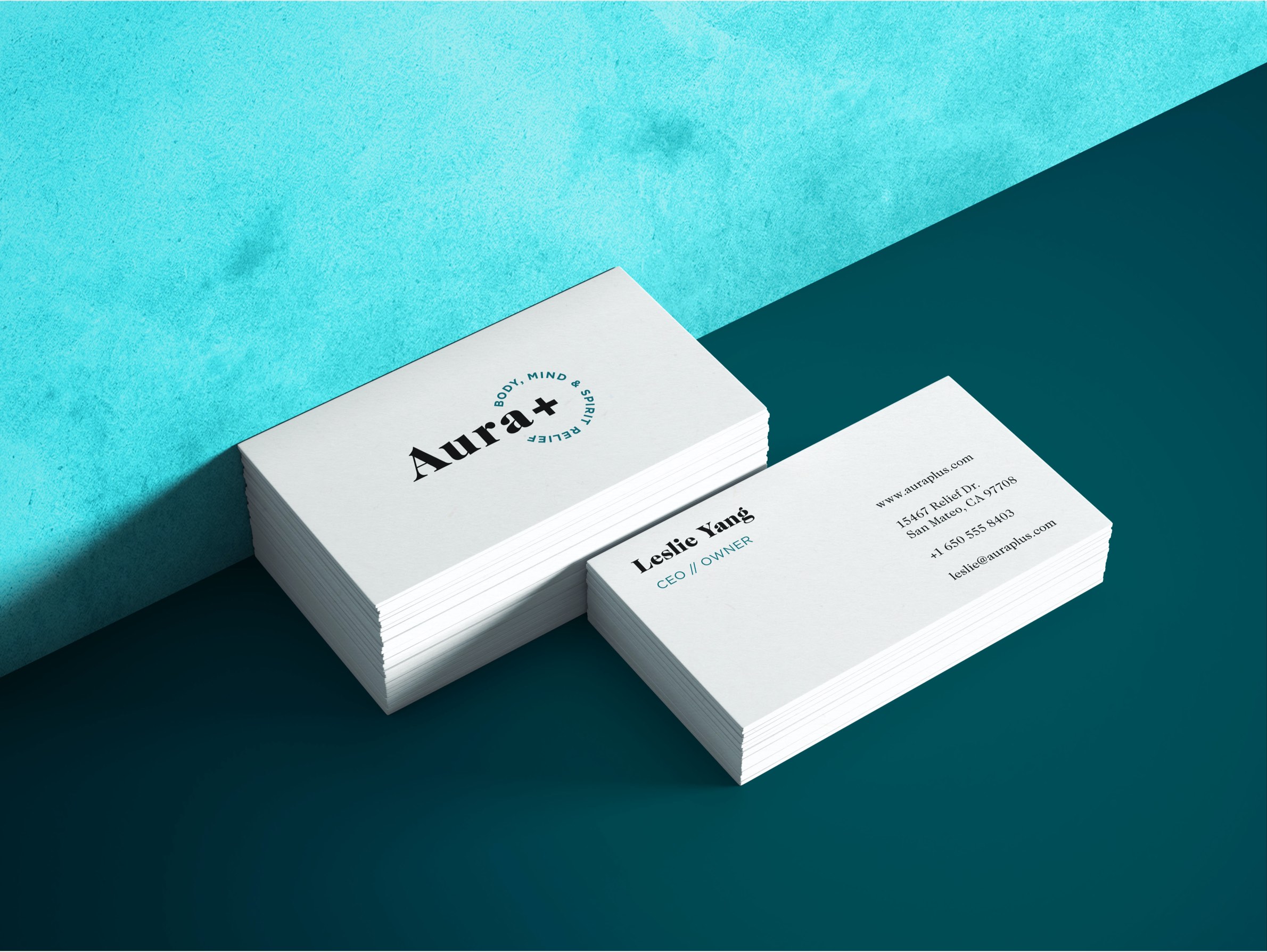
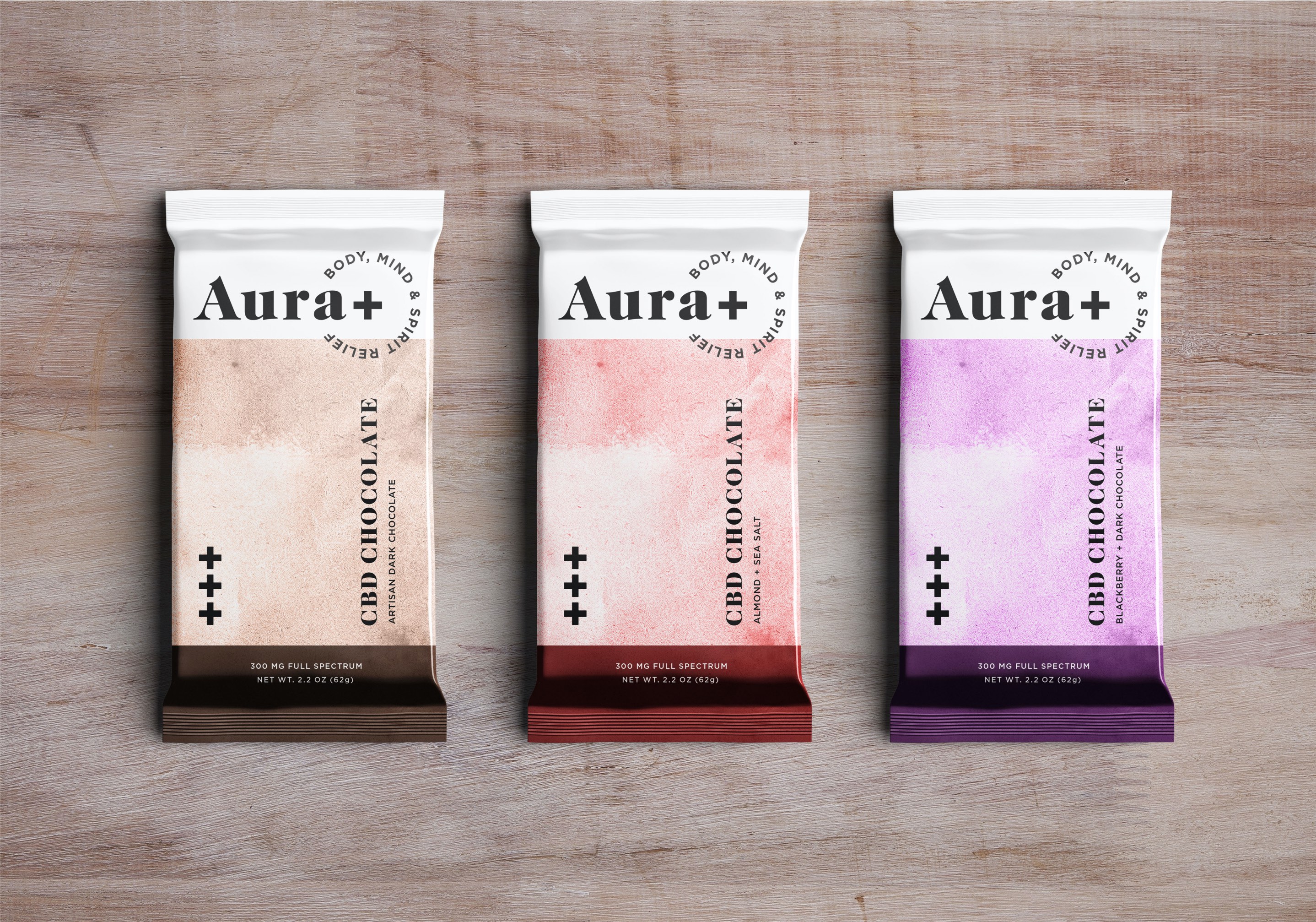
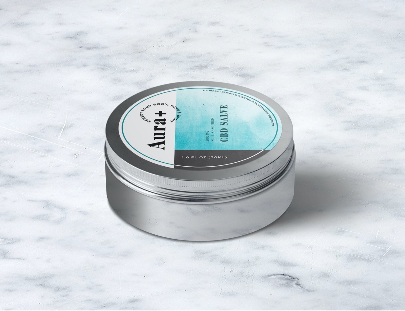
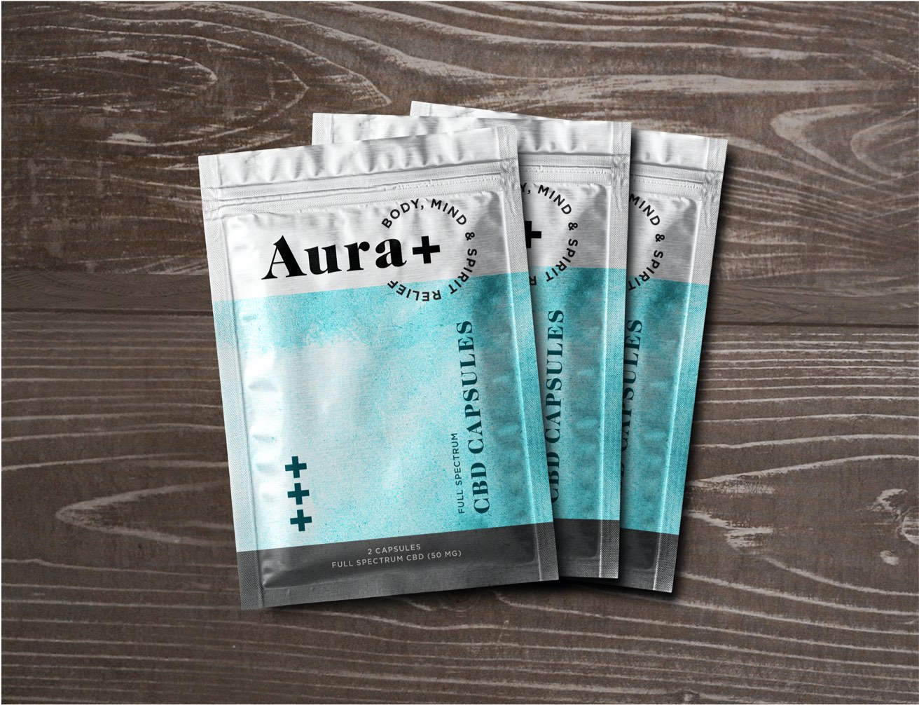
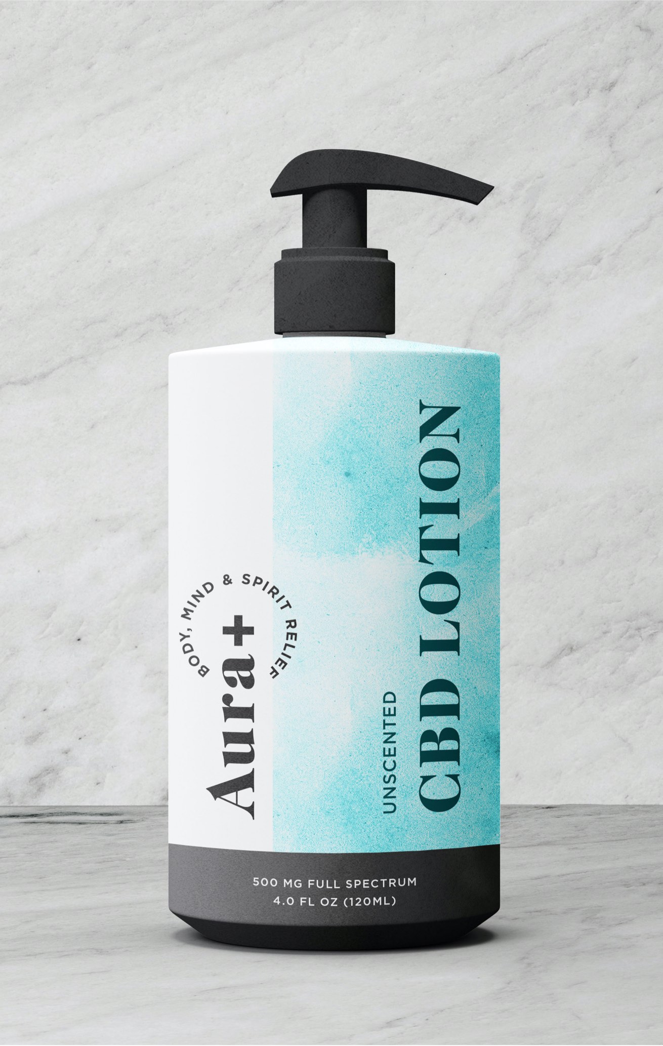
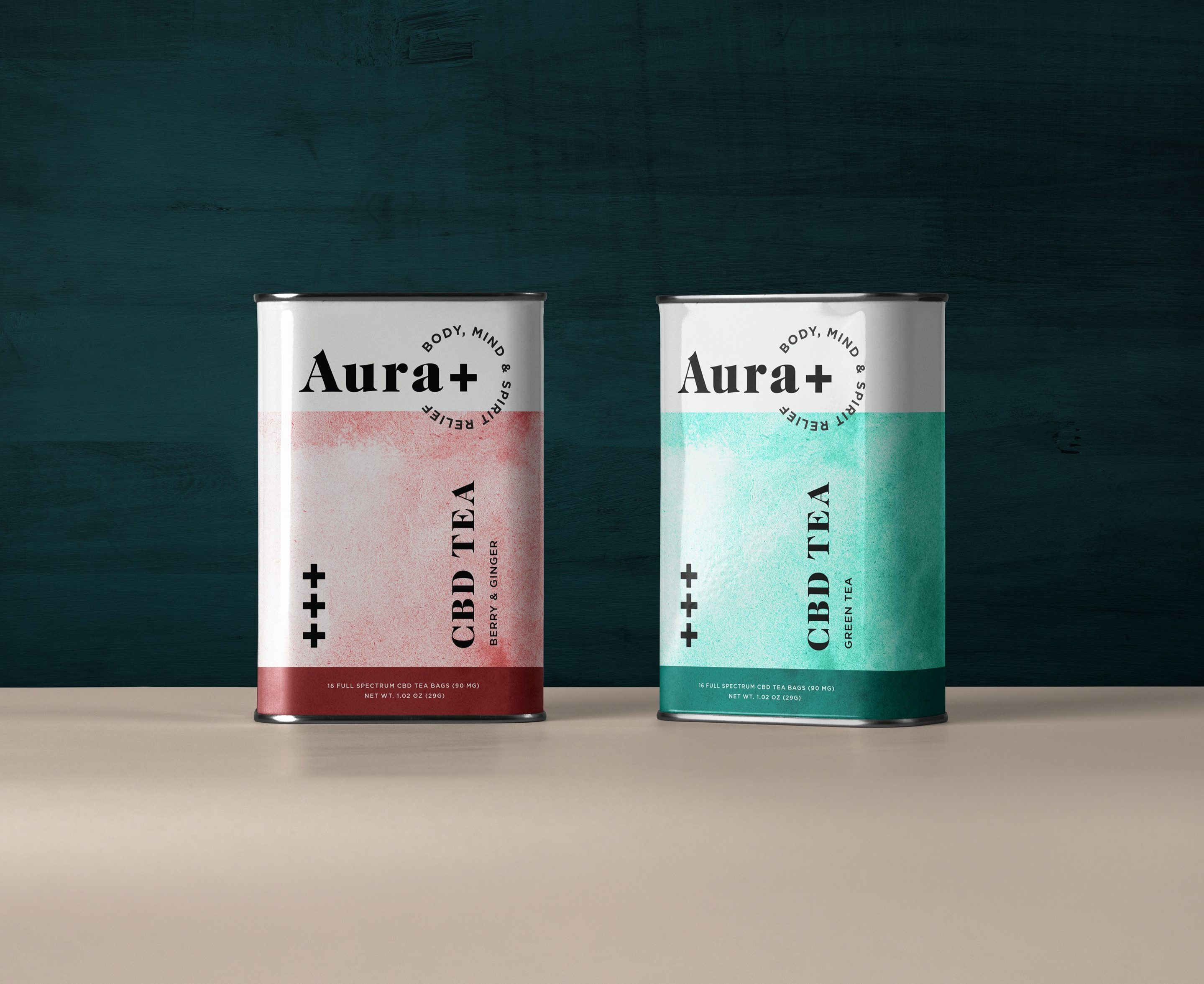
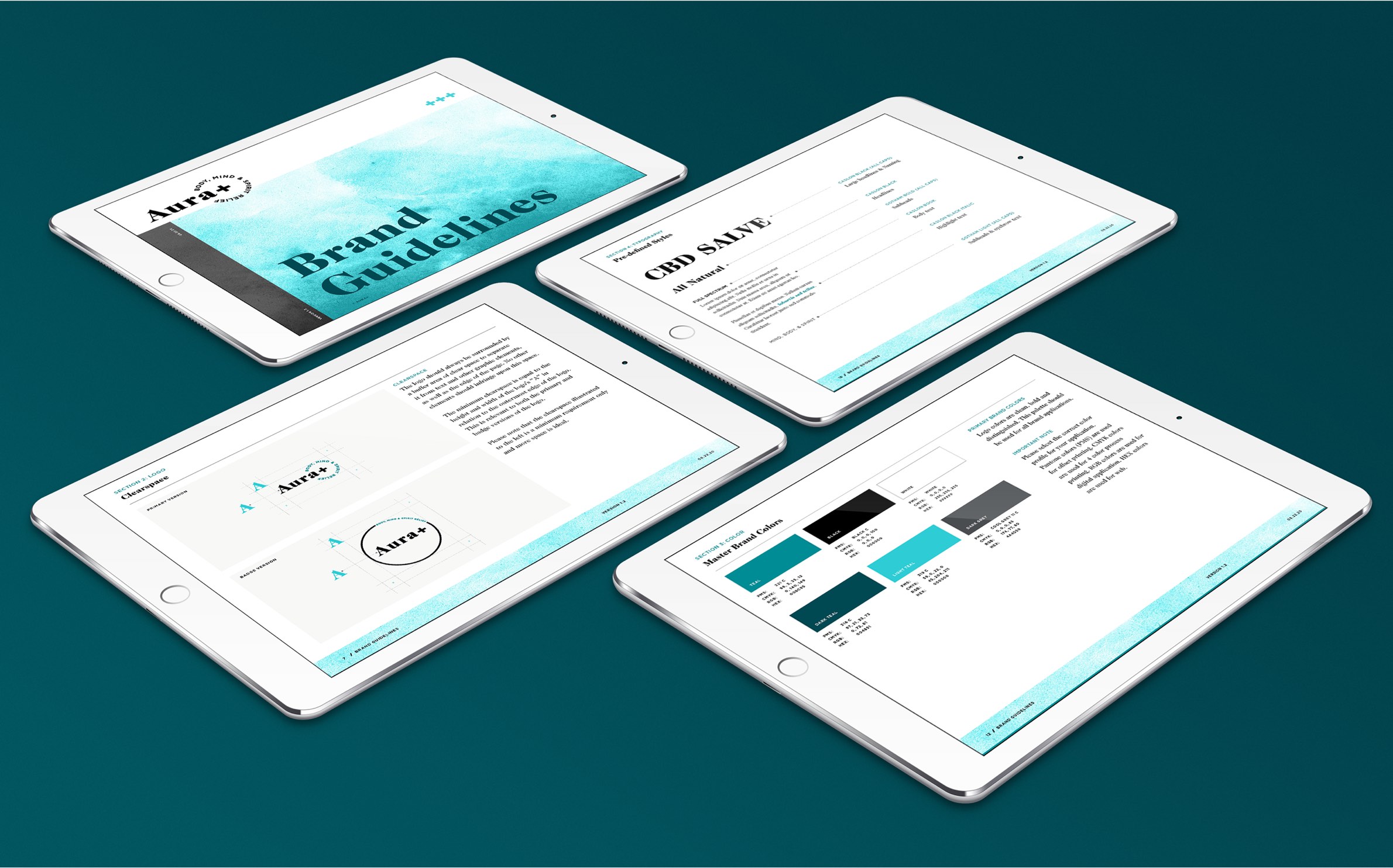
Develop a name, brand identity, website and packaging system that speaks to millennials searching for solutions to chronic pain, inflammation, insomnia, anxiety and mental health. The final name and logo touches on overall health and wellness — “Aura” meaning life force and vitality, and “plus” for betterment. The primary color palette uses blue and teal due to its calming psychological qualities and additional colors are used to distinguish flavors in food packaging where applicable.
Scope
- Logo Design
- Naming
- Packaging
- Printed Materials/Collateral
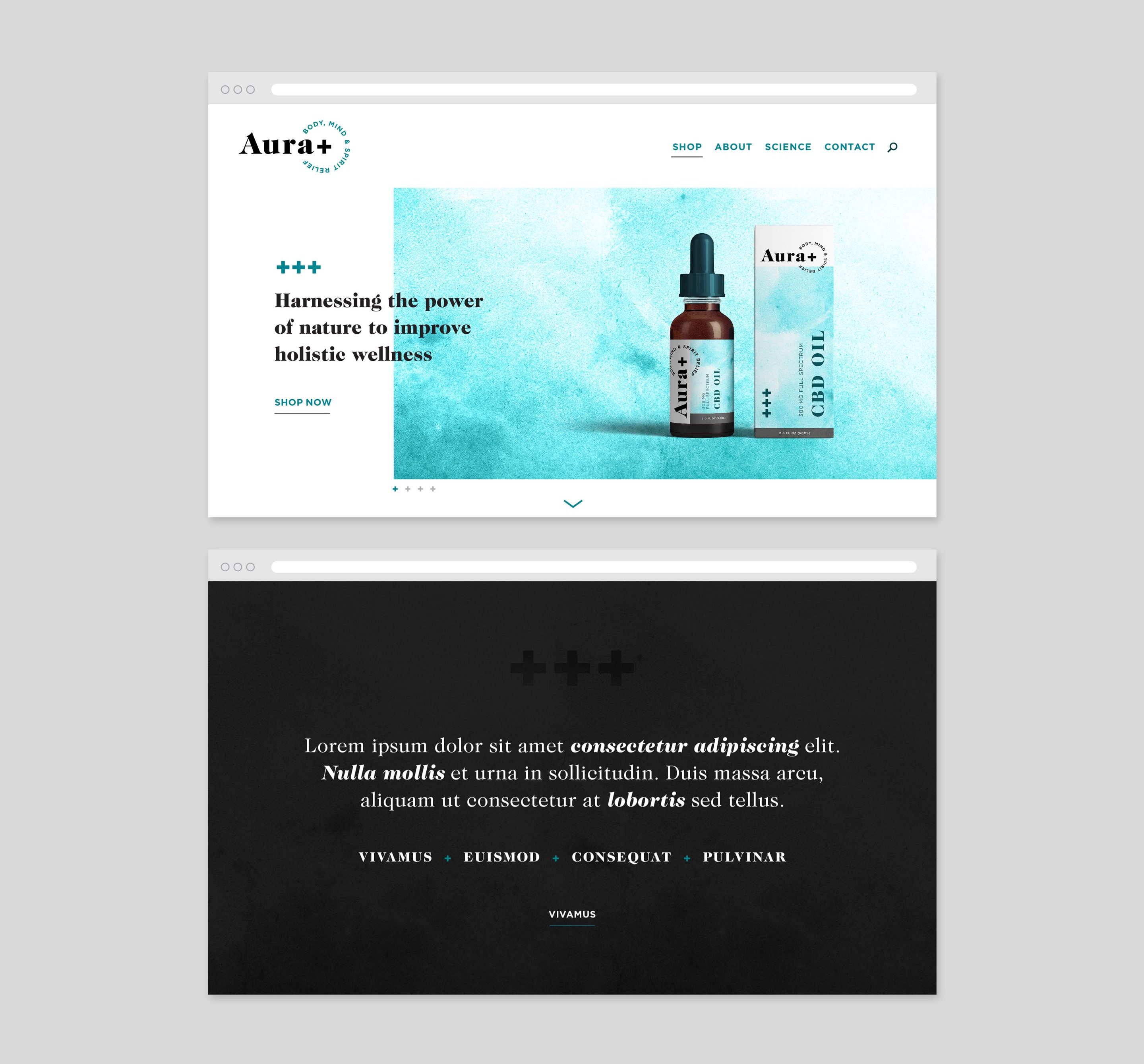
- UI & UX Design
- Visual Identity
