Cynthia Spence Design
Cynthia Spence Design is a full-service interior design firm serving the San Francisco Bay Area. Cynthia’s mission is to design timeless interiors that provide solace and an oasis of calm in this increasingly noisy world.
Objective
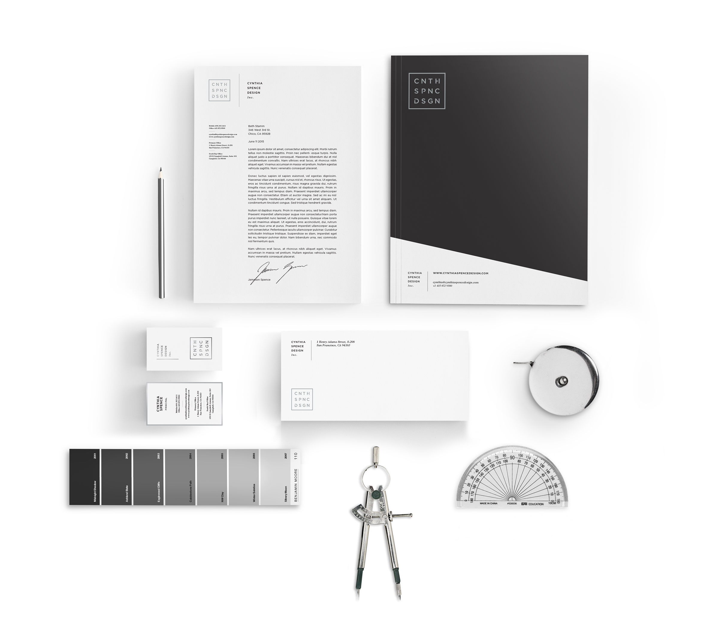
Develop a brand identity and website experience that captures the essence of Cynthia and her work — elegant, simplistic, creative and sophisticated. Her new logomark plays on the idea that less is more by removing the vowels in her name. Her logomark is also framed to imply that she works within a given interior space. Her new website uses subtle animation effects and transitions for a unique and sophisticated user experience. Large photography and image zooming is also used so Cynthia’s work can be seen in the highest level of detail possible.
Scope
- Copywriting/Messaging
- Logo Design
- UI & UX Design
- Visual Identity
- Web Development


